Chelsea Master Bath, Project Report – The Before
Recently I was hired to design and manage a Master Bath renovation in downtown Manhattan. In this post, I’d like to share with you a bit about the front end of the design process – the before. In another post, I’ll review the end stages of the project – the after.
The Before
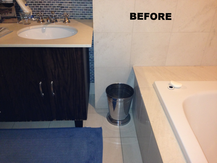
The Master Bathroom and adjoining dressing area is large, especially by Manhattan standards, with a double vanity, separate bath and shower, and room for storage. The existing materials were of decent quality, with beige tiles and darker mosaic accents. The couple was generally happy with the layout of the space. So why renovate?
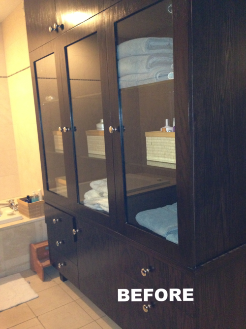
Driving the initial discussion were some functional issues – the Jacuzzi tub no longer jacuzzied, and the tile and the storage pieces were showing some serious age. Water issues elsewhere in the building had caused ceiling sconces to fill with water and collapse on more than one occasion. The room was sometimes cold in the winter and poorly ventilated in the summer. The plug-in towel warmer was broken. In fact, there were enough broken things to justify a complete overhaul, and while we were at it, we’d improve the design too.
In addition to the initial list of things that were broken, here’s what else I saw and heard during my first discussions and walk-throughs:
The bathroom felt too big. How is that possible? Simple - the space was not fully used, visually or functionally, with empty unlit walls and little connection between the different areas.
The storage pieces were stand-alone components – furniture within the room. A perfectly fine way to furnish a bathroom but in this case, slightly on the large side leaving awkward gaps in between the storage pieces and other fixtures. Here’s a tip: Either a gap needs a purpose or it should be eliminated. Also, the client indicated not all of the space was needed or well used.
The lighting was limited to one over-the-mirror vanity light plus a couple of recessed lights and sconces. Ok, but not great for illuminating such a large space and not variety enough to be effective.
Limited Lighting Variety and Bulky Shower
The shower was bulky and closed-in.
The materials and colors scheme was (in the client’s own words) “meh."
I hope I’m not sounding too harsh. Most of the time when I see room for improvement with a current space, there are very rational reasons behind those issues.
Lighting is tricky, and lighting technology is constantly changing to allow for improvement. Who knows what plumbing issues lurk behind the walls (especially in NYC apartments) and drive bathroom design decisions. With finish styles (color, materials etc.), there are definite times in one’s life when simple is better - when the rest of your life is hectic, when your budget is more limited, when you’re getting ready to sell, when you just want to get something done and done quickly.
The Process
I spent time in the existing space. In interior design terms this is part of the “documenting” phase. I took pictures and some measurements, sketched out oddities of how things fit together or didn’t, tested lights and other fixtures, and opened cabinets and drawers (I will only do so with a client’s permission and if they ask me to tackle storage issues).
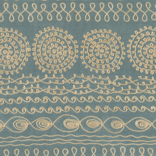
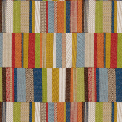
I also spent time in other parts of the apartment, especially in this case, the attached Master Bedroom. I had already worked with the family on some small projects – furnishing upgrades, window treatments, and such - so I had a head start on their design aesthetic as well as functional objectives. For example, in their Master Bedroom they had developed a calm space with a few bursts of colorful pattern. I had chosen a combination of quilted and embroidered fabrics for bedroom accents in the form of a bench and ottomans.
Two fabrics used in the adjoining bedroom and hints for color goals:
The clients did a great job of telling me what they did and didn’t like when it comes to bathroom design. I try to do this with all clients, and it’s as much about listening to what someone doesn’t like as to what someone finds “visually pleasing.” Even if the client's input is delivered in writing and through images, I like to review verbally and ideally with all users of the space (in this case a couple). I’m fairly confident in my listening skills and so much is communicated beyond the written or spoken word.
Side note: I know I always say this, but interior design is about Form AND Function. Thematic AND Thoughtful. Nowhere is this more relevant than in a Master Bath.
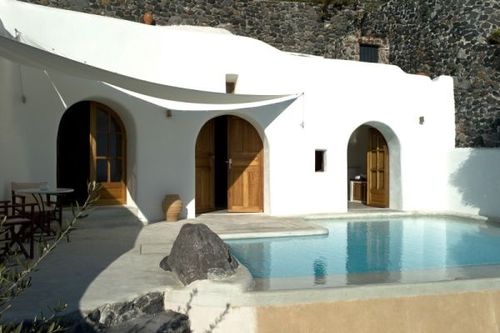
In an early conversation, the client mentioned the Greek Island of Santorini as a possible inspiration. This was the final clue in the bathroom design. I searched my memory of my own brief visit there many years ago, sought out a number of images, and matched them with my own design views and cues from the couple’s home.
This image, plus all of the above, inspired the design
What did this mean? At first glance, it could mean the picture postcard of white buildings, blue skies, black sand, some bougainvillea. Not a bad inspiration, but anyone who has read my blog before may know, there’s something deeper I like to bring to my spaces whenever possible. So it’s not just the typical postcard image, but it’s the full experience of a place – the nature, the textures, the age. I found this photo. Still lovely - possibly even a postcard - but somehow more evocative.
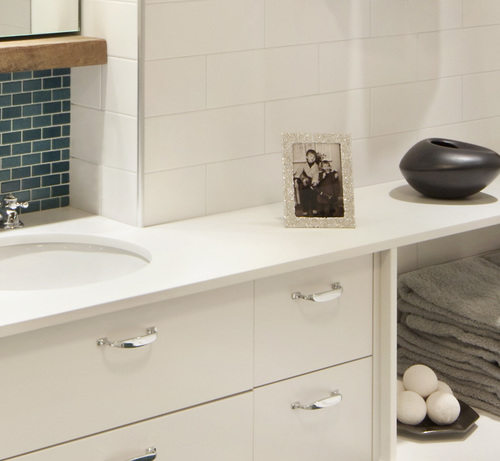
Sneak Peek to "The After"
Coming soon...the renovation from start to finish and the final outcome. Here’s a Sneak Peek.
In the interim, please comment or let me know if you have any questions...
