C is for COLOR
My first quick-color-post idea was a review of the various "color of the year" reports. Paint companies like Benjamin Moore, PPG, and Sherwin Williams all announce a palette of annual colors, and Donald Kaufman Paints even highlights a "color of the month." They're often gorgeous, tonal and soothing — wonderful qualities for one's home — but as I started to write I quickly became distracted by an itch for brave, bright and expressive colors.
Maybe it's the rainy weather outside my studio window. Maybe it's a rebellion against "safe" designs. Or perhaps I'm just in the mood to shake things up and ruffle some feathers - including my own...
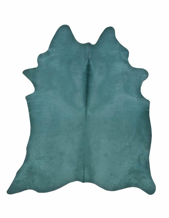
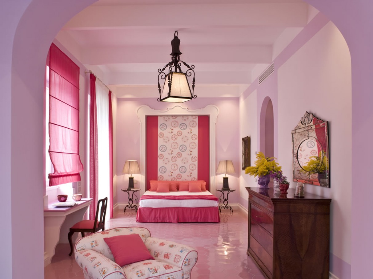
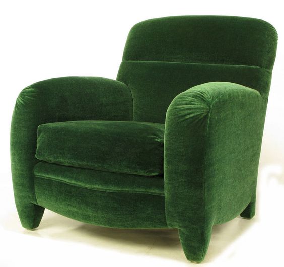
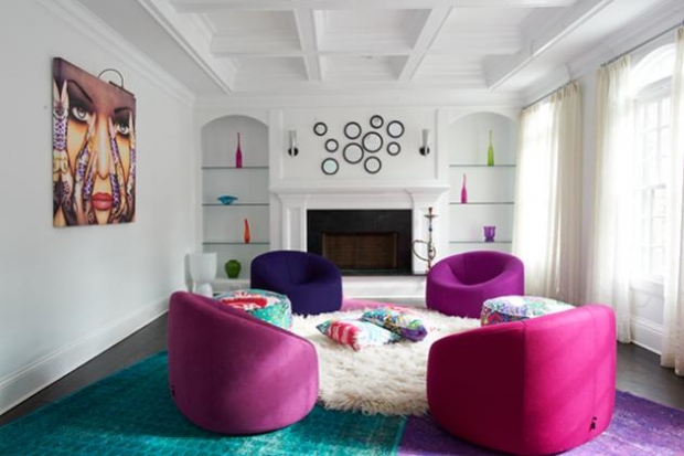
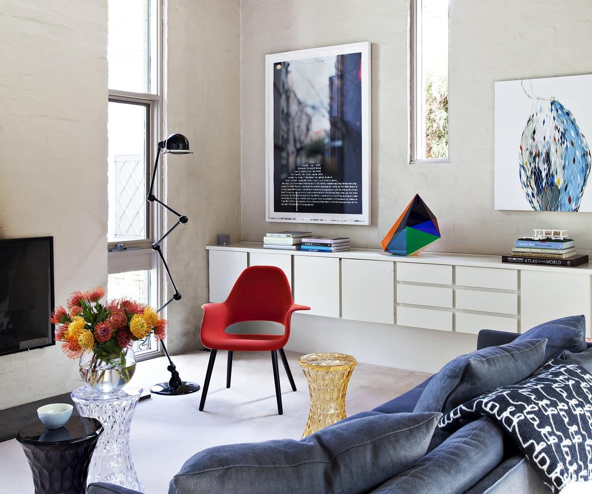
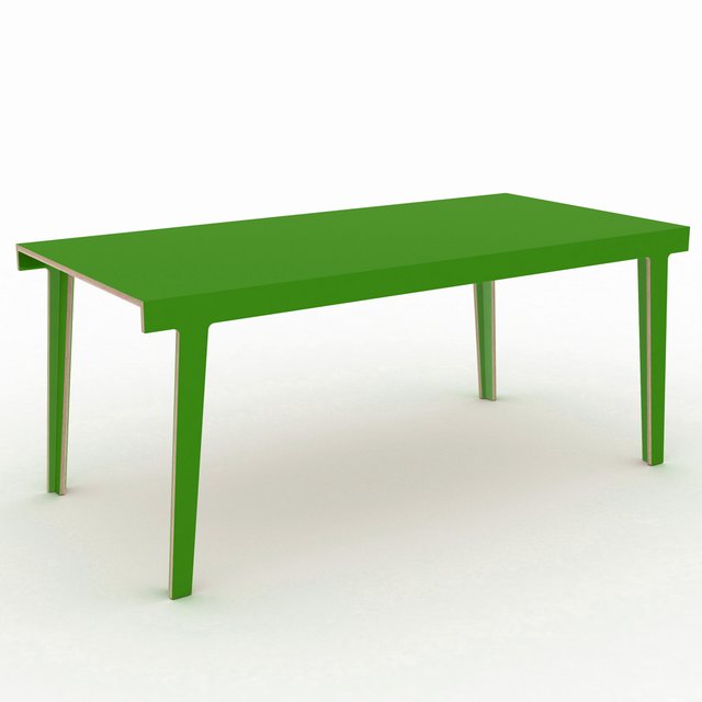
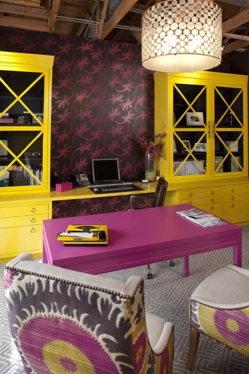
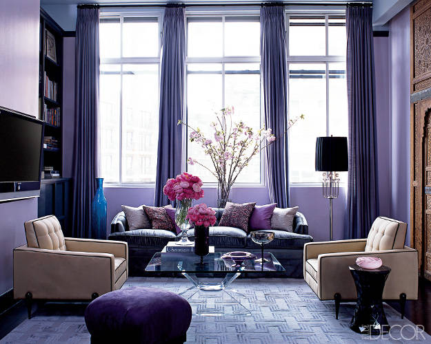
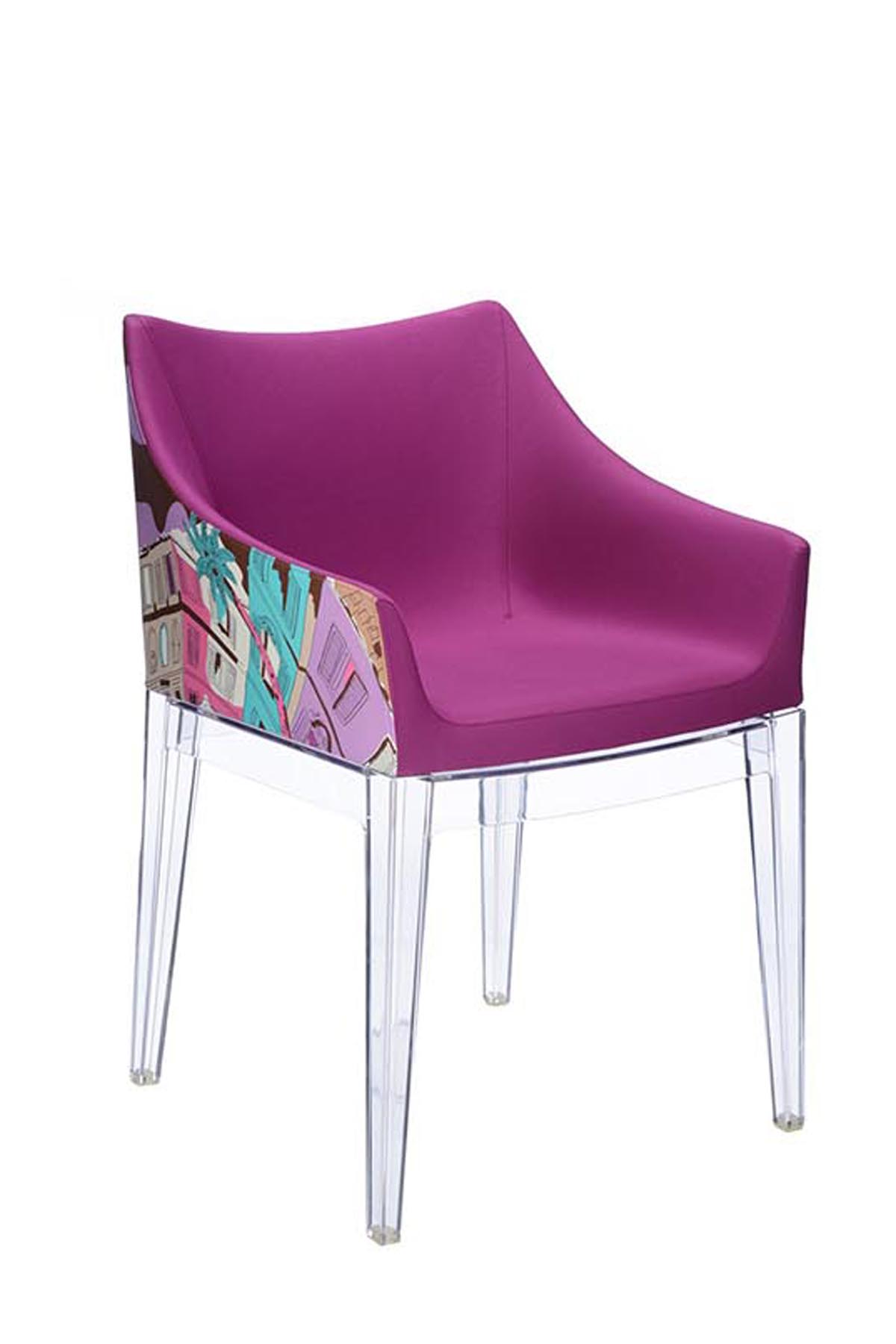
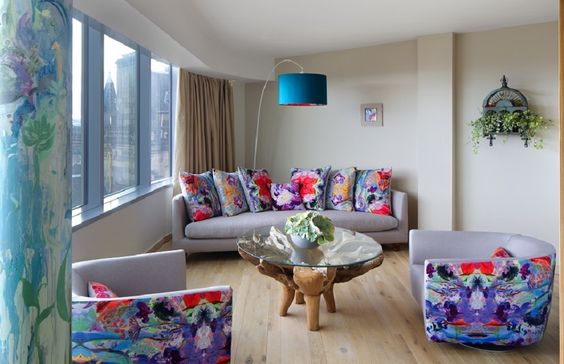
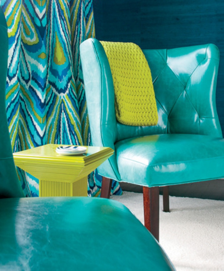
This spring move beyond the accent pillow and experiment with bold, funky, beautiful furniture and rooms. Let's channel our inner 80's pop star and be happy!
A few examples...
More inspiration, plus links and details, on my C is for Color pinterest board.
Anyone ready for a bold color adventure? Contact me and let's get started!


