North Fork Family Retreat: Project Report on Materials
For me, every interior design project is unique – filtered through the lens of the client, the space and location, plus the scope of the project and budget. In this post, I share a selection of personal insights and images on materials used in the interior design renovation of my family’s weekend retreat on the North Fork of Long Island. In another post I share information on furnishings.
We’re very happy with the space, a fully renovated home plus a newly constructed pool house. For my family, it’s a perfect retreat from our busy Manhattan lives. It is somehow cozy and open, warm and cool, and just the right size. I hope you enjoy.
Five Insights on Materials
Our red and gold partition wall
This one evolved during the project. The living space is separated into two open zones — One is a traditional living room that houses our fireplace and connects to the screened-in porch, the other is smaller and more cozy with a TV and connection to the Master Bedroom. We played around with some complicated perforated wall ideas which were very cool, but not so useful in our limited space and perhaps not in line with our budget. That being said, as a default feature wall, I wanted to do something with the surface. One day, reading through a book on creativity, I gazed at the deep red of the cover and internally committed to bringing in this warm rich color into the project. The brassy gold glaze further highlighted the warmth and evoked a wash of beach sand.
Reclaimed softwood floors in the house and textured concrete floors in the pool house
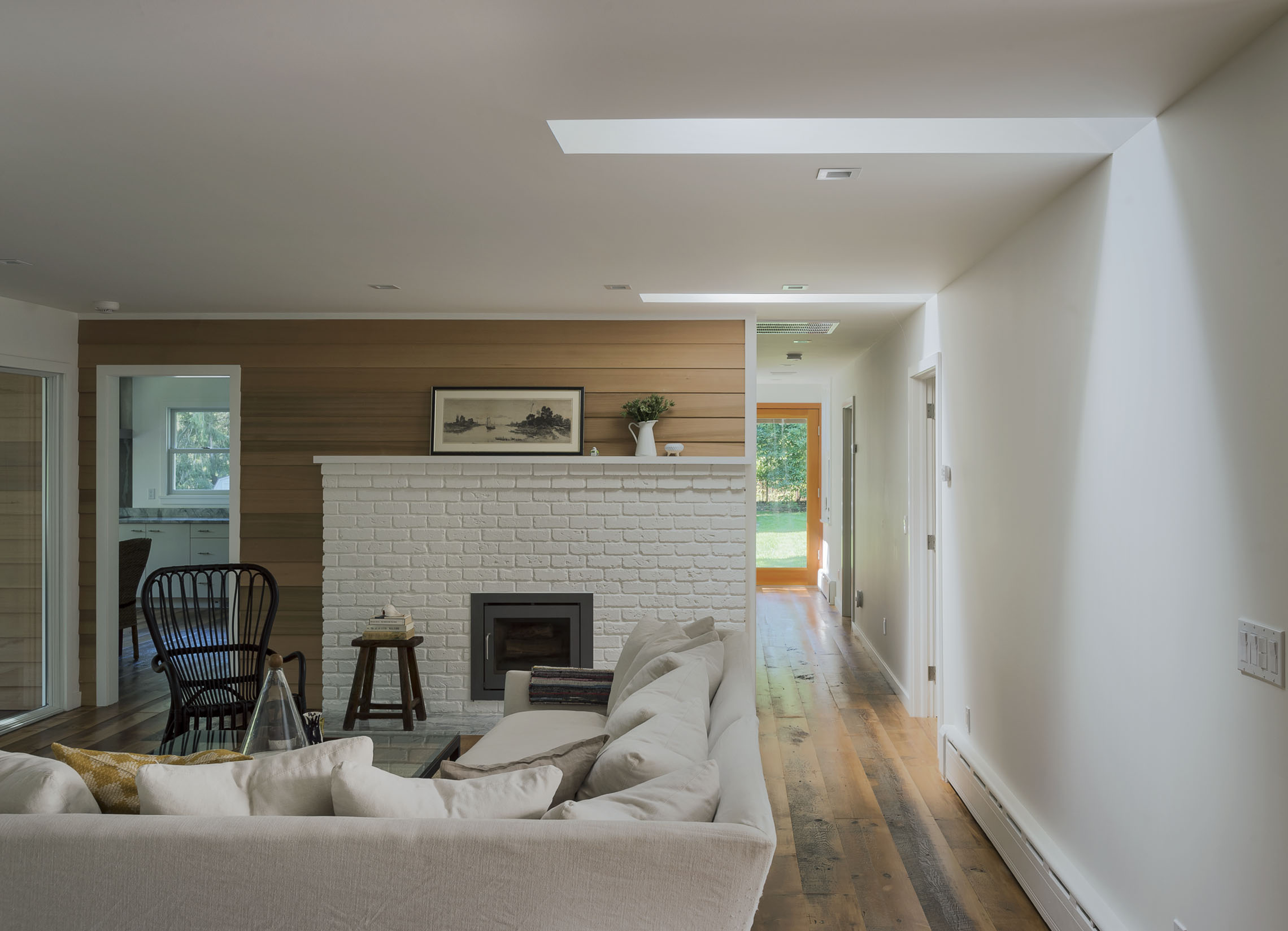
I wrote about the reclaimed wood floors in a previous post. I have forever coveted wide-planked softwood floors, but in my family’s NYC full-time home, this didn’t make sense. On the North Fork it’s a perfect homage to the agricultural community and history of the area. However, for my design goals, the busyness of the reclaimed wood floors needed to be offset with lighter and cleaner materials.
The flooring of the detached pool house and patio area was originally specified as tile. We switched to a textured concrete option for three reasons: 1) There is flexibility of tone and color available when installing a concrete floor. I chose a very warm hue, similar to southwest clay red, to provide a visual link between the modern lines of the new pool house and the more traditional brick details of the existing pool surround. 2) Concrete is affordable to purchase and install. The pool house was constructed near the tail end of the project as we were starting to feel budget-weary. 3) It is simply a very cool material that I wanted to try as flooring. We added a loose “pockmarked” texture as finish to add safety and caution against “slippery when wet” concerns.
Natural light via light wells (“light” as material)
One of our original goals in renovating our old ranch style home was to raise the just under 8 foot ceiling. Without going into the frustrating details of this – our contractor and architect worked hard to come up with a solution, but once we understood some of the existing structural issues, we decided the solutions were prohibitively expensive. Instead, we relied on a variety of architectural elements to bring light into the space. Especially interesting was the addition of light wells to the living area. Light wells are essentially a method of pulling in natural light from the outdoors via a lens in the roof, bouncing the light around a tube as it travels to the interior space in order to increase the illumination. The result is a very soft and lovely addition of light.
A Cocoon Bedroom
We wanted our bedroom to feel cozy and light and unencumbered – the feeling of being inside a cocoon, glowing softly from the sun. To create our cocoon, we reused our simple white hand-me-down and outlet store furniture and surrounded the space with a grasscloth ceiling and wallcovering. On a sunny day, the room radiates natural gold and quiet.
Bathroom Materials
I am a self-described materials junky, so the prospect of designing all-new bathrooms was exciting and the limited budget was a fun challenge.
The Master Bath pulls together a double glaze accent tile from Heath, a creamy version of a subway tile, and a stone-like porcelain tile with maple cabinetry and a walnut countertop.
The powder room is simple and easy to clean with a crosscut wood pattern tile and painted white wood paneling.
The Kids’ Bath riffs off of the red cardinal birds who visit our yard and the blue of the pool with red glass accent tile and a blue recycled acrylic countertop material from 3-form.
A last minute and very quick and affordable addition to the project, our guest bath (outside of the original scope of renovation) was dingy and dated. We brightened the space with a combination of white and black porcelain tiles, an off the shelf wood and porcelain vanity, and a few other details such as new lighting and accessories. While very simple in design, I love highlighting that even a plain jane inexpensive redesign (with the addition of a few special details) can provide big impact.
The pool house kitchenette/sink area repeats the blue 3-form counter material and stays super functional and simple with stainless steel shelves and racks, ceramic wall lights, and a bright yellow mirror for fun.
Click here for more Project Reports, including reflections on furnishing elements.
Contact us for questions, comments or help with designing your own family retreat.


